Seasonal Jewelry Packaging Trends: Spring vs Winter Collections
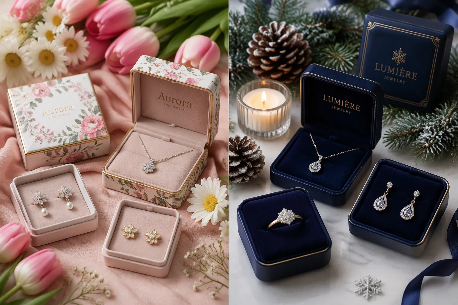
Spring jewelry packaging embraces pastels, eco-materials, and floral motifs that mirror renewal. Winter designs lean rich and celebratory with jewel tones, velvet, and metallic accents. This seasonal contrast shapes how customers perceive and value each piece. A jewelry packaging manufacturer understands that seasonal jewelry packaging trends influence perceived value, unboxing shares, and repeat purchases. Seasonal packaging for spring uses light textures and botanical details. Winter seasonal packaging incorporates festive patterns and luxurious finishes. These seasonal themes guide design choices for custom jewelry boxes, jewelry pouches, and every Jewelry Display. Smart brands align packaging with the season to strengthen emotional connections with their jewelry.
Seasonal Jewelry Packaging Trends: Color Palettes Compared
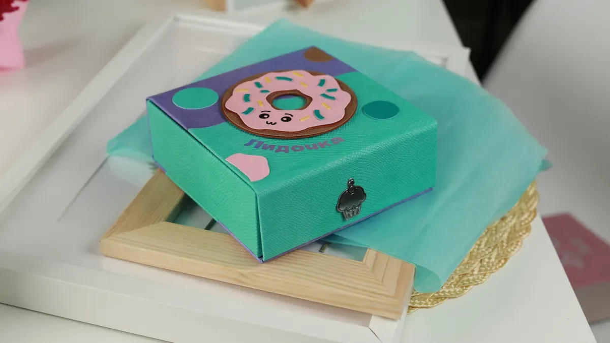
Color sets the emotional foundation of every jewelry packaging design. The right palette can make a customer feel the freshness of a spring morning or the warmth of a winter evening. Brands that study seasonal jewelry packaging trends understand one core principle: color does more than decorate a box. It tells the customer what season they hold in their hands.
Spring's Light and Airy Palette
Spring palettes lean soft, bright, and optimistic. These hues mirror the season's natural awakening. They also create a sense of lightness that customers associate with new beginnings.
Blush Pink, Mint Green, and Lavender
Blush pink, mint green, and lavender form the backbone of spring jewelry packaging. Blush pink carries a gentle, romantic quality. Mint green adds a crisp, botanical freshness. Lavender brings a calm, dreamy softness. Together, these three shades create a palette that feels both modern and timeless.
These colors work especially well for delicate pieces. A pair of rose gold studs or a pearl pendant sits beautifully against a blush pink box. Mint green complements silver and white gold. Lavender pairs naturally with amethyst and other purple stones.
Butter Yellow and Sky Blue Accents
Butter yellow and sky blue serve as accent colors in spring packaging. Butter yellow adds warmth and cheerfulness. Sky blue introduces a sense of calm and openness. Designers often use these shades on ribbons, tissue paper, or interior linings.
The emotional responses these colors trigger are well documented. Sky blue evokes serenity and freedom. Blush pink evokes softness and romance. These associations make spring packaging feel personal and inviting.
| Color | Emotional Response |
|---|---|
| Sky Blue | Serenity and freedom |
| Blush Pink | Softness and romance |
Why Soft Neutrals Signal Freshness
Soft neutrals like cream, ivory, and pale gray anchor spring palettes. These tones provide visual rest. They also let brighter accent colors stand out without competition. A cream box with a mint green ribbon feels clean and intentional.
Soft neutrals signal freshness because they mimic natural materials. Think of unbleached cotton, raw linen, or light wood. Customers read these textures as pure and honest. That perception transfers directly to the jewelry inside.
Pastel packaging — blush pink, mint green, lavender, sky blue — signals the season immediately and creates a cohesive, gift-ready aesthetic that resonates with spring shoppers. Floral-printed tissue paper adds a romantic unboxing reveal.
Winter's Rich and Moody Palette
Winter palettes move in the opposite direction. They embrace depth, saturation, and drama. These colors reflect the season's long nights and festive gatherings.
Emerald, Sapphire, and Ruby Tones
Emerald, sapphire, and ruby tones dominate winter jewelry packaging. Emerald green suggests evergreen trees and quiet elegance. Sapphire blue evokes midnight skies and royal luxury. Ruby red brings warmth and celebration. These jewel tones carry a natural association with precious stones.
A sapphire blue box holding a diamond ring feels regal. An emerald green pouch containing a gold bracelet feels sophisticated. A ruby red box with a pearl necklace feels festive and bold.
Burgundy, Plum, and Midnight Blue
Burgundy, plum, and midnight blue offer darker, moodier alternatives. Burgundy brings a sense of aged wine and velvet luxury. Plum adds mystery and depth. Midnight blue feels formal and serene. These shades appeal to customers who want sophistication without bright color.
Brands often use these deeper tones for limited-edition holiday collections. The darker palette signals exclusivity. It also photographs beautifully under warm lighting.
Gold, Silver, and Champagne Metallics
Metallic accents complete the winter palette. Gold foil, silver stamping, and champagne shimmer add richness and reflectivity. These finishes catch the eye and suggest high value. A matte burgundy box with gold foil lettering feels immediately premium.
Metallics also tie winter packaging to holiday traditions. Gold and silver appear in ornaments, wrapping paper, and festive decor. Customers associate these finishes with celebration and gift-giving.
Matching Palette to Product and Audience
Color choice should never happen in a vacuum. The best palettes connect the packaging to the product and the customer. This alignment strengthens the entire brand experience.
Pairing Stone Colors With Packaging Hues
Smart brands pair packaging hues with the stones they sell. A turquoise ring looks stunning in a warm cream box. An emerald pendant shines against a deep charcoal or black background. A ruby ring pops against a soft ivory or champagne lining.
This pairing works because contrast draws the eye. A light stone needs a darker backdrop. A dark stone needs a lighter one. The packaging becomes a frame for the jewelry, not a competitor.
When to Break the Seasonal Color Rule
Seasonal themes offer useful guidance, but they are not absolute laws. Some brands break the rules successfully. A minimalist brand might use black packaging year-round. A bridal collection might use white or ivory regardless of season.
Consider these situations for breaking seasonal color conventions:
- The product itself carries strong seasonal meaning, such as a holiday birthstone.
- The target audience prefers a signature brand color over seasonal variation.
- The collection launches across multiple seasons and needs visual consistency.
- The brand operates in a market with no strong seasonal buying patterns.
Autumn and spring share certain warm neutral tones. Winter and summer both work with cool metallics. Brands can find crossover shades that serve multiple seasons. This approach reduces inventory costs and simplifies production.
The key is intentionality. A brand that breaks the seasonal color rule should do so for a clear reason. Random color choices confuse customers. Purposeful ones build recognition.
Colors, patterns, and symbols all work together to tell a seasonal story. When a brand gets the palette right, every other design element falls into place. The trends that matter most are the ones that connect emotionally with the buyer.
Jewelry Packaging Materials: Spring's Eco-Light vs Winter's Luxe
Material selection shapes the tactile experience of jewelry packaging. The season dictates direction. One approach emphasizes lightweight, natural materials that signal purity and renewal. Another relies on dense, textured materials that communicate warmth and celebration. These choices directly influence perceived value. Brands that study seasonal jewelry packaging trends understand how material decisions connect customers to the season.
Spring's Natural and Recyclable Materials
Spring packaging prioritizes environmental consciousness without compromising aesthetic quality. Brands choose substances that feel organic and renewable. These decisions align with the season's character.
Recycled Paper and Kraft Board
Recycled paper forms the backbone of this approach. Kraft board offers a sturdy yet natural appearance. Visible fibers and subtle texture signal authenticity. A kraft box holding a silver necklace feels honest and intentional. Recycled materials reduce environmental impact while maintaining high design standards. Brands can use recycled cardboard for outer boxes and structural elements.
Linen, Cotton, and Jute Textures
Natural fabrics add a tactile dimension. Linen provides a crisp, textured feel. Cotton offers softness and familiarity. Jute introduces a rustic, earthy quality. These fabrics work well for pouch closures or interior linings. A linen pouch for earrings feels premium yet understated. These textures distinguish a brand from competitors using standard glossy materials.
Seed Paper and Compostable Inserts
Seed paper represents an innovative step in sustainable packaging. Customers can plant the paper after use. Flowers or herbs grow from embedded seeds. This creates a memorable brand interaction. Compostable inserts offer another eco-friendly option. Materials like mushroom mycelium provide protective cushioning. These choices position a brand as forward-thinking. A brand using seed paper for product cards demonstrates genuine commitment to the environment.
Winter's Opulent and Tactile Materials
Winter packaging moves toward richness and sensory depth. These materials create a feeling of abundance and careful craftsmanship.
Velvet and Satin Pouches
Velvet provides a classic texture. Its soft nap catches light and feels luxurious. Satin offers a smooth, glossy alternative. Both materials protect delicate pieces while adding visual appeal. A velvet pouch for a gold bracelet feels immediately special. Customers often repurpose these pouches for storage. This extends the brand's presence beyond the initial purchase.
Metallic Foil and Embossed Cardstock
Metallic foil adds reflectivity and celebration. Gold foil on a deep green box catches candlelight. Silver foil on a navy surface suggests frost. Embossed cardstock creates raised patterns. Stars, snowflakes, or geometric patterns gain dimension. These techniques communicate attention to detail. A brand using foil stamping signals premium positioning.
Ribbons, Wax Seals, and Magnetic Closures
Decorative closures complete the experience. Satin ribbons in deep jewel tones wrap boxes with elegance. Wax seals add a ceremonial quality. Customers must break the seal to open the package. This builds anticipation. Magnetic closures provide a satisfying snap. The sound and weight contribute to a premium feel. Heavyweight embossed paper with a ribbon tie creates an unboxing ritual.
Balancing Sustainability With Luxury
Brands face a central challenge. One demands richness and celebration. Sustainability requires reduced environmental impact. These goals can coexist with thoughtful design.
Eco-Friendly Options for Winter Packaging
Several strategies allow packaging to remain luxurious while embracing sustainability. Brands can use recycled cardboard with a premium finish. A matte black box from recycled fibers looks indistinguishable from virgin material. Natural dyes create deep jewel tones without chemical processing. FSC-certified paper serves all printed materials. Renewable energy in production further reduces impact.
One case study documents sustainable packaging solutions across a global supply chain. This example shows how eco-friendly packaging can integrate at scale without compromising brand image. A practical guide covers how brands adopt sustainable practices while preserving a premium unboxing experience. Minimalist design reduces material usage. Simplifying designs lowers waste. This appeals to environmentally conscious consumers. Brands can ensure full recyclability of packaging components. These practices build a responsible reputation.
Cost Considerations Across Both Seasons
One packaging approach typically costs less. Recycled paper and kraft board have lower material costs. Natural fabrics like cotton and jute remain affordable. Seed paper carries a premium but serves as a marketing investment.
The other approach requires higher investment. Velvet and satin cost more than natural fabrics. Foil stamping and embossing add production steps. Wax seals and magnetic closures increase per-unit costs. However, the higher perceived value can justify the expense.
Brands should analyze their margins carefully. Seasonal packaging for spring allows investment in elaborate presentations for other periods. Limited edition collections for winter can use premium materials. Exclusivity generates buzz and encourages quick purchases.
The integration of sustainability within luxury packaging represents a significant trend. Reducing plastic usage through material substitution is achievable. Brands can replace plastic inserts with recycled fiber alternatives. This shift aligns with customer expectations. Sustainable practices do not require sacrificing quality.
Seasonal packaging emphasizes lightness and environmental responsibility for one period. It emphasizes celebration and tactile indulgence for another. These seasonal themes guide material selection across the year. Some brands adjust packaging for autumn as a transitional season. Both approaches strengthen emotional connections between customer and jewelry.
Design Motifs: Spring's Blooms vs Winter's Festive Icons
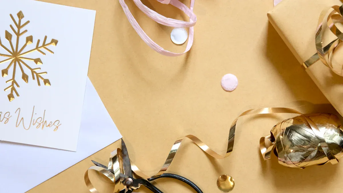
Design motifs carry the visual weight of seasonal storytelling. They transform a simple box into a recognizable seasonal object. Brands that track seasonal jewelry packaging trends know one truth: motifs do the emotional work that color and material alone cannot achieve. A blossom printed on tissue paper says spring without a single word. A snowflake embossed on a lid says winter just as clearly. These small visual cues guide customer expectations before the box even opens.
Spring's Nature-Inspired Motifs
Spring motifs draw directly from the natural world. They celebrate growth, color, and the return of life after a cold season. Designers pull from gardens, meadows, and woodland scenes to build these visual identities.
Florals, Blossoms, and Botanical Line Art
Florals dominate spring design. Cherry blossoms, tulips, peonies, and daisies appear on boxes, pouches, and tags. Each flower carries its own symbolic weight. Cherry blossoms suggest fleeting beauty. Tulips signal renewal. Peonies represent prosperity and romance.
Botanical line art offers a more restrained option. Thin, single-weight lines trace leaves, stems, and petals without heavy color. This style suits minimalist brands. It also prints cleanly on kraft board and recycled paper. A simple fern frond stamped in gold on a cream box feels elegant and modern.
Butterflies, Birds, and Garden Details
Butterflies bring movement and lightness to spring designs. Their wings offer endless pattern possibilities. Brands often place them near logos or along box edges. Birds add a similar sense of life. Hummingbirds, swallows, and songbirds appear frequently in spring collections.
Garden details complete the picture. Designers include small elements like dewdrops, vines, and trellises. These touches create a spring garden atmosphere on a small surface. A jewelry box with a subtle vine border feels connected to the season without overwhelming the product inside.
Minimalist Watercolor and Hand-Drawn Styles
Watercolor techniques soften spring motifs. The medium creates gentle color bleeds and organic edges. No two prints look exactly alike. This imperfection feels human and warm. Hand-drawn illustrations carry the same quality. They suggest care and craftsmanship.
These styles appeal to customers who value authenticity. A hand-painted floral pattern on a pouch signals a small-batch, thoughtful brand. The visual softness also complements delicate jewelry pieces like pearl strands or thin gold chains.
Winter's Festive and Celestial Motifs
Winter motifs turn toward celebration, light, and the night sky. They reflect the season's holidays, long evenings, and gatherings. These designs feel richer and more dramatic than their spring counterparts.
Snowflakes, Frost, and Icicle Patterns
Snowflakes rank among the most recognizable winter motifs. Each one offers geometric symmetry and delicate detail. Brands print them in silver foil, white ink, or embossed relief. Frost patterns mimic the crystalline shapes that form on cold glass. Icicle patterns hang from box edges or frame logo placements.
These motifs work across many product categories. A snowflake-stamped box suits a diamond pendant. A frosted pouch fits a silver bracelet. The cool, crisp imagery pairs naturally with white gold, platinum, and diamond pieces.
Stars, Holly, and Evergreen Branches
Stars bring a celestial quality to winter packaging. They suggest guidance, hope, and celebration. Holly and evergreen branches add traditional holiday warmth. These motifs connect directly to Christmas and New Year traditions. Customers recognize them instantly.
Evergreen branches also carry a sensory association. They evoke the scent of pine and the feeling of a warm room in cold weather. A box decorated with evergreen sprigs feels cozy and inviting. This emotional pull strengthens the gift-giving experience.
Art Deco and Geometric Holiday Accents
Art Deco patterns offer a sophisticated alternative to traditional holiday motifs. Clean lines, fan shapes, and repeating geometric forms create a glamorous look. This style recalls the 1920s and the golden age of jewelry design. It appeals to customers who want holiday spirit without literal imagery.
Geometric accents also photograph well. They create strong visual patterns for social media and product listings. A black box with gold geometric lines feels festive and modern at the same time.
Typography and Logo Treatment by Season
Typography carries brand identity across every seasonal variation. The font choice, weight, and finish all communicate something about the season and the brand. Designers adjust these elements to match the mood of each collection.
Airy Scripts and Light Serif Fonts for Spring
Spring typography leans light and open. Airy scripts mimic handwriting and feel personal. Light serif fonts add elegance without heaviness. Both styles leave generous white space around the text. This breathing room reinforces the season's fresh, uncluttered feeling.
A thin script logo on a blush pink box feels romantic and approachable. A light serif font on a mint green tag feels clean and modern. These choices suit brands that position themselves as effortless and contemporary.
Bold Serifs and Foil-Stamped Logos for Winter
Winter typography moves toward weight and drama. Bold serifs command attention and suggest tradition. Foil-stamped logos add shine and reflectivity. Gold, silver, and champagne foils catch light and draw the eye. These treatments signal premium quality and celebration.
A heavy serif logo in gold foil on a deep emerald box feels luxurious and festive. A silver-stamped logo on midnight blue feels elegant and cold-weather appropriate. These choices suit brands that emphasize craftsmanship and occasion.
The table below summarizes the typography contrast between the two seasons.
| Element | Spring | Winter |
|---|---|---|
| Font style | Airy scripts, light serifs | Bold serifs, heavy weights |
| Finish | Matte, uncoated | Foil-stamped, embossed |
| Spacing | Generous white space | Dense, layered |
| Mood | Fresh, personal | Luxurious, celebratory |
Design motifs and typography work together to complete the seasonal picture. When seasonal themes and elements align across color, material, and graphics, the packaging feels intentional and cohesive. Customers notice the difference even when they cannot name it. That coherence builds trust and strengthens brand identity over time.
The Unboxing Experience: Spring's Fresh Minimalism vs Winter's Luxury
The unboxing experience transforms a simple purchase into a memorable moment. Each season calls for a distinct approach. Spring favors speed and lightness. Winter favors ritual and depth. Brands that master both create stronger emotional connections with their customers.
Spring's Clean and Effortless Unboxing
Spring unboxing feels quick and refreshing. The design removes barriers between the customer and the jewelry. Every element supports a light, airy reveal.
Single-Layer Reveals and Open-Top Boxes
Open-top boxes dominate spring jewelry packaging. A customer lifts the lid and sees the piece immediately. No drawers, no tiers, no delays. This directness mirrors the season's sense of renewal. A single-layer reveal feels honest and unpretentious.
Light Tissue Paper and Simple Seals
Light tissue paper wraps the jewelry inside the box. A simple paper seal or sticker holds the tissue in place. These elements add polish without weight. A mint green seal on cream tissue paper feels fresh and intentional. The customer peels it back with minimal effort.
A Quick, Airy, Instagram-Ready Moment
Spring unboxing photographs beautifully. Natural light catches the pastel tones. The simple layout creates clean, uncluttered images. Customers share these moments on social media without prompting. The speed of the reveal suits short-form video formats. A quick, airy unboxing fits the season's energy.
Winter's Layered and Ceremonial Unboxing
Winter unboxing slows everything down. The design builds anticipation through multiple steps. Each layer adds drama and delight.
Multi-Tier Boxes and Drawer Slides
Multi-tier boxes create a sense of discovery. Customers pull drawers or lift panels one at a time. The table below shows effective design elements from real case studies.
| Design Element | Case Study Example | Customer Feedback |
|---|---|---|
| Multi-tiered drawer pull-outs | Liberty London Beauty Calendar 2025 | Highlights luxury and ceremonial reveal through sequential drawers |
| Accordion-style folding panels | Onyx Coffee Lab Advent Calendar 2025 | "A very clever and eye-catching unboxing experience" |
| Hidden compartments | Liberty London golden tickets | Adds surprise and exclusivity |
| Paper sculpture unfolding | FreshCut Paper Woodland Winter Wonderland | Turns unboxing into a magical, reusable experience |
Hidden Compartments and Surprise Reveals
Hidden compartments add mystery to holiday-centered packaging. A small drawer conceals a gift tag or a care card. The customer discovers it last. This surprise creates a memorable moment. Brands use this technique to reward careful exploration.
Heavier Weight and Richer Sound Cues
Winter packaging feels heavier in the hand. Magnetic closures snap shut with a satisfying click. Ribbons slide across textured paper. These sound cues signal quality and occasion. The weight itself communicates value.
"A very clever and eye-catching unboxing experience. Each compartment holds a different coffee, arranged in a fan-like structure. It looks beautiful and elegant on the table." — Onyx Coffee Lab customer
Personalization Touches for Each Season
Personal touches strengthen the bond between brand and customer. Each season offers unique opportunities for connection.
Spring: Handwritten Notes and Seed Packets
A handwritten note adds warmth to spring seasonal packaging. The message feels personal and genuine. Seed packets offer a second gift. Customers plant them and remember the brand. This touch aligns with the season's themes of growth and renewal.
Winter: Custom Ornaments and Gift Tags
Winter personalization leans toward keepsakes. A custom ornament doubles as decoration. A personalized gift tag makes the package ready for giving. These touches extend the brand's presence beyond the initial purchase. Customers display these items throughout the holiday season.
Seasonal themes and elements shape every part of the unboxing ritual. Spring delivers speed and freshness. Winter delivers depth and ceremony. Both approaches strengthen the customer's connection to the jewelry inside.
Psychological Drivers Behind Seasonal Jewelry Trends
Consumer behavior research reveals that seasonal packaging triggers deep emotional responses. These responses shape purchase decisions before customers consciously evaluate a product. Understanding these psychological mechanisms helps brands connect with buyers on a meaningful level.
Why Spring Packaging Evokes Fresh Starts
Spring packaging activates associations with renewal and new beginnings. The human brain links certain colors and textures to seasonal changes. Brands leverage these connections to create powerful emotional experiences.
Renewal, Optimism, and Lightness
Pastel shades and neutral tones create a sense of understated luxury. Muted colors suggest authenticity and eco-consciousness. These associations align perfectly with spring's message of growth and fresh starts. Colors tap into subconscious cues that shape consumer perceptions through snap judgments. Muted tones suggest authenticity while neon colors evoke energy. Spring packaging uses this principle to signal purity and optimism.
The Desire for Clean, Guilt-Free Luxury
Modern consumers want luxury without environmental guilt. Spring packaging addresses this desire through sustainable materials and clean designs. Recycled paper and compostable inserts communicate responsibility. Customers feel good about their purchase. This positive emotion transfers to the jewelry inside.
Packaging color can shape perception before a customer reads any copy. A shade can quietly suggest freshness, reliability, or luxury, and that suggestion feeds into the buying decision below the level of conscious thought.
Why Winter Packaging Evokes Warmth and Occasion
Winter packaging operates on different psychological principles. Rich textures and deep colors trigger feelings of celebration and nostalgia. Historical references in packaging design add a touch of nostalgia and create connection with consumers.
Celebration, Gifting, and Nostalgia
Winter seasonal packaging taps into holiday traditions and gift-giving rituals. Deep reds and emerald greens evoke memories of celebrations past. Brands incorporating historical elements see higher engagement and brand loyalty. Retro aesthetics and childhood-inspired motifs evoke joy and comfort.
The Psychology of Rich Textures and Deep Colors
Color psychology explains why winter palettes feel luxurious and warm. The table below shows key associations.
| Color | Psychological Association |
|---|---|
| Deep Red | Luxury, warmth, indulgence, sophistication |
| Green | Joy, tranquility, nature |
| Black | Stability, intelligence, elegance |
| Blue | Creativity, trust, dependability |
The deep red on the Cocoa Santé Parisien label grabs your attention instantly—it's bold, luxurious, and exudes warmth and indulgence.
Aligning Emotion With Purchase Intent
Emotional alignment drives purchasing decisions across both seasons. Brands must understand who buys and why.
Self-Purchase vs Gift-Purchase Mindsets
Self-purchase buyers seek personal connection and self-reward. Gift-purchase buyers prioritize presentation and perceived value. Seasonal packaging addresses both mindsets through thoughtful design choices.
Seasonal Timing and Buying Triggers
Timing influences buying behavior significantly. Spring triggers renewal-focused purchases. Winter triggers celebration and gifting purchases. Brands that align seasonal themes with these triggers see stronger results. Sensory cues like tactile finishes and unique textures elevate the unboxing experience and drive memorability.
Actionable Insights for Jewelry Brands
Building a Two-Season Packaging Playbook
A two-season playbook helps jewelry brands manage costs and maintain consistency. This approach separates permanent elements from seasonal variations.
Core Structural Elements to Keep Year-Round
Certain components should remain constant across all seasons. The box structure, insert design, and protective materials stay the same. These elements form the foundation of brand identity. A sturdy outer box with reliable cushioning works for spring and winter alike. Brands save money by ordering these components in bulk. Consistent structure also ensures product safety during shipping.
Seasonal Swaps That Cut Costs and Waste
Brands can swap only the decorative layers each season. Sleeves, ribbons, tissue paper, and inserts offer easy customization points. A spring sleeve with botanical prints costs less than redesigning the entire box. Winter swaps might include velvet pouches or foil-stamped lids. This strategy reduces waste and keeps inventory manageable. Custom packaging solutions that use modular designs support sustainability goals.
Testing and Rolling Out Seasonal Designs
Smart jewelry brands test seasonal designs before full production. This practice minimizes risk and reveals customer preferences.
Small-Batch Pilots and Customer Feedback
A small-batch pilot lets brands gauge reaction without large investment. They produce limited quantities of new seasonal packaging. Loyal customers receive these early versions and share feedback. Surveys and social media polls capture honest opinions. This data guides refinements before a full launch.
Timing Production Ahead of Each Season
Production timelines matter for seasonal packaging strategies. Brands should finalize designs three to four months before each season. Manufacturing and shipping require lead time. Seasonal shopping trends show that Valentine's Day, Mother's Day, and December holidays drive up to 40% of annual jewelry sales. Campaigns should launch six to eight weeks before these dates. Early planning prevents rushed orders and ensures quality.
Marketing Seasonal Packaging Online
Online marketing brings seasonal packaging to life for remote customers. Visual content and strategic messaging drive engagement.
Photography and Video That Showcase the Season
High-quality photography helps products stand out. Lifestyle shots depict jewelry in everyday scenarios. Video content consistently outperforms static images for jewelry. Short videos show pieces in motion and highlight sparkle. Brands can create unboxing videos that showcase the packaging experience. These formats work well for limited-time packaging reveals.
Messaging That Ties Packaging to the Collection's Story
Messaging should connect packaging to the collection's narrative. A spring collection might emphasize renewal and growth. Winter messaging focuses on celebration and gifting. Platform-specific strategies matter here. Instagram and Pinterest excel for visual showcases. TikTok reaches younger demographics through trend-focused content. Influencer partnerships extend reach through styled photos and unboxing videos. These collaborations lend credibility and attract potential customers. Consistent messaging across channels strengthens brand identity and supports seasonal packaging strategies.
Spring packaging wins with pastels, eco-materials, and floral motifs that signal renewal. Winter packaging wins with jewel tones, velvet, and metallic accents that signal luxury. These seasonal jewelry packaging trends demonstrate how seasonal packaging shapes customer perception.
Brands that use seasonal packaging as a storytelling tool build stronger loyalty. Deloitte research shows storytelling brands outperform competitors in customer loyalty by up to 20%. Forty percent of consumers are more likely to repurchase from a brand that delivers premium seasonal packaging. One in five consumers watches unboxing videos before purchasing, driving word-of-mouth.
Jewelry brands should start small. Pick one or two seasonal packaging swaps. Test them with customers. Scale what resonates.
FAQ
How often should a jewelry brand refresh its seasonal packaging?
Most brands refresh designs twice yearly for spring and winter collections. Some add autumn transitions. The refresh cycle depends on production capacity and marketing calendars. Brands should align updates with major buying periods.
What is the most cost-effective way to test seasonal packaging?
Small-batch pilots offer the lowest risk. Brands produce limited quantities and gather customer feedback. Social media polls provide quick insights. This approach prevents costly full-production mistakes before a wider launch.
Can a jewelry brand use the same box structure year-round?
Yes. Core structural elements like box shape and insert design work across all seasons. Brands swap only decorative layers such as sleeves, ribbons, and tissue paper. This strategy reduces costs and simplifies inventory management.
Which materials work best for sustainable seasonal packaging?
Recycled paper, kraft board, and compostable inserts suit spring designs. For winter, brands can use FSC-certified paper with natural dyes. Velvet alternatives from recycled fibers exist. Sustainability and luxury can coexist with thoughtful material selection.
How far in advance should brands plan seasonal packaging production?
Brands should finalize designs three to four months before each season. Manufacturing and shipping require lead time. Campaigns should launch six to eight weeks before major holidays. Early planning prevents rushed orders and quality issues.
Does seasonal packaging really affect customer purchase decisions?
Yes. Research shows 40% of consumers repurchase from brands with premium seasonal packaging. One in five watches unboxing videos before buying. Packaging shapes perceived value and drives word-of-mouth sharing.
What typography works best for each season's packaging?
Spring favors airy scripts and light serif fonts with generous spacing. Winter calls for bold serifs and foil-stamped logos. These choices reinforce each season's emotional tone and strengthen brand recognition.
How can brands measure seasonal packaging success?
Brands track unboxing shares, social media mentions, and repeat purchase rates. Customer surveys capture emotional responses. Comparing seasonal performance reveals which designs resonate most with target audiences.
See Also
Top Holiday Jewelry Gift Packaging Strategy For Ultimate Seasonal Success
Ten Luxury Jewelry Packaging Design Trends To Watch In 2026
Best Luxury Jewelry And Clothing Packaging For Upscale Retail In 2026
Designing Jewelry Packaging For Online Subscription Boxes: A How To Guide
Why Personalized Jewelry Packaging And Customization Represent The Future